The Best Church Logos of July
July was a pretty good month. In this edition we have six wonderful church logos created by some very talented designers. Enjoy!

July was a pretty good month. In this edition we have six wonderful church logos created by some very talented designers. Enjoy!

This month we have a very nice selection of church logos. Lots of good stuff. Enjoy!

A lovely branding and signage project by NUU Church Media for CrossWinds Church.

This is the beginning of a new series of posts which will feature the best designed church logos of the month that’s just gone by. Enjoy!

Here’s a great project by Nate Perry, a professional designer at Webster. Tasked with updating the branding of Dundee Presbyterian Church, Nate used the church’s iconic steeple in a stained-glass motif that is at once classic, yet contemporary.

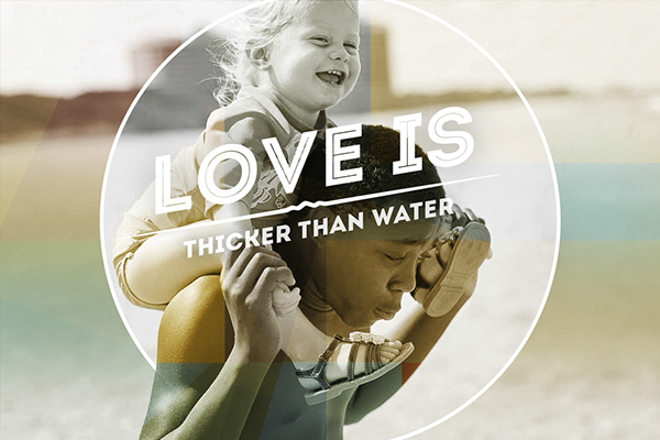
A really beautiful brand concept for Citylight Church. The project, a collaboration between Alex Klohr, Ben Masanga and David Yoder, took five months and involved creating a discovery questionnaire, creative brief, unique selling proposition (USP), and the brand concept, “An Adopted Family”.

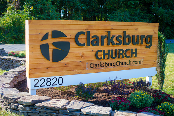
A really nice project by Keren Hernandez that involved creating a new branding system, signage, social media, web, and print materials for Fairfax Community Church’s launch of a new campus called Clarksburg Church.

This is the first part in a mini-series of articles that feature church logos based on their primary color. It should be fun!

Without a doubt, the visual identity is one of the pillars of any strong brand. It supports the brand as a whole and it’s more or less comprised of these elements:

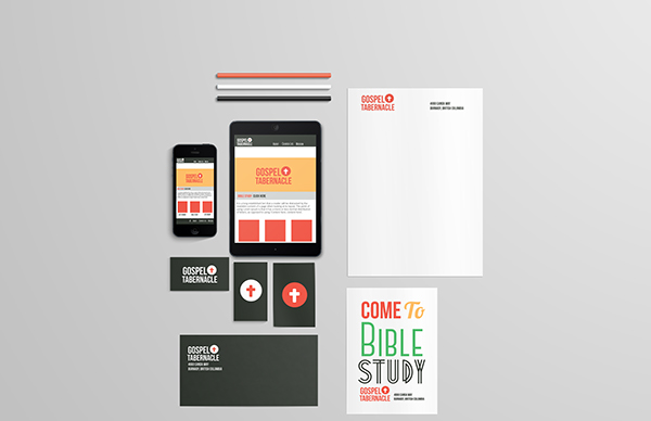
Since the first “Inspiring church stationery designs” article was so popular last week, I decided to make a sequel for it. I hope you enjoy it!